OXFORD COMMA
A colorful, eye-catching magazine for bookworms and writers alike.
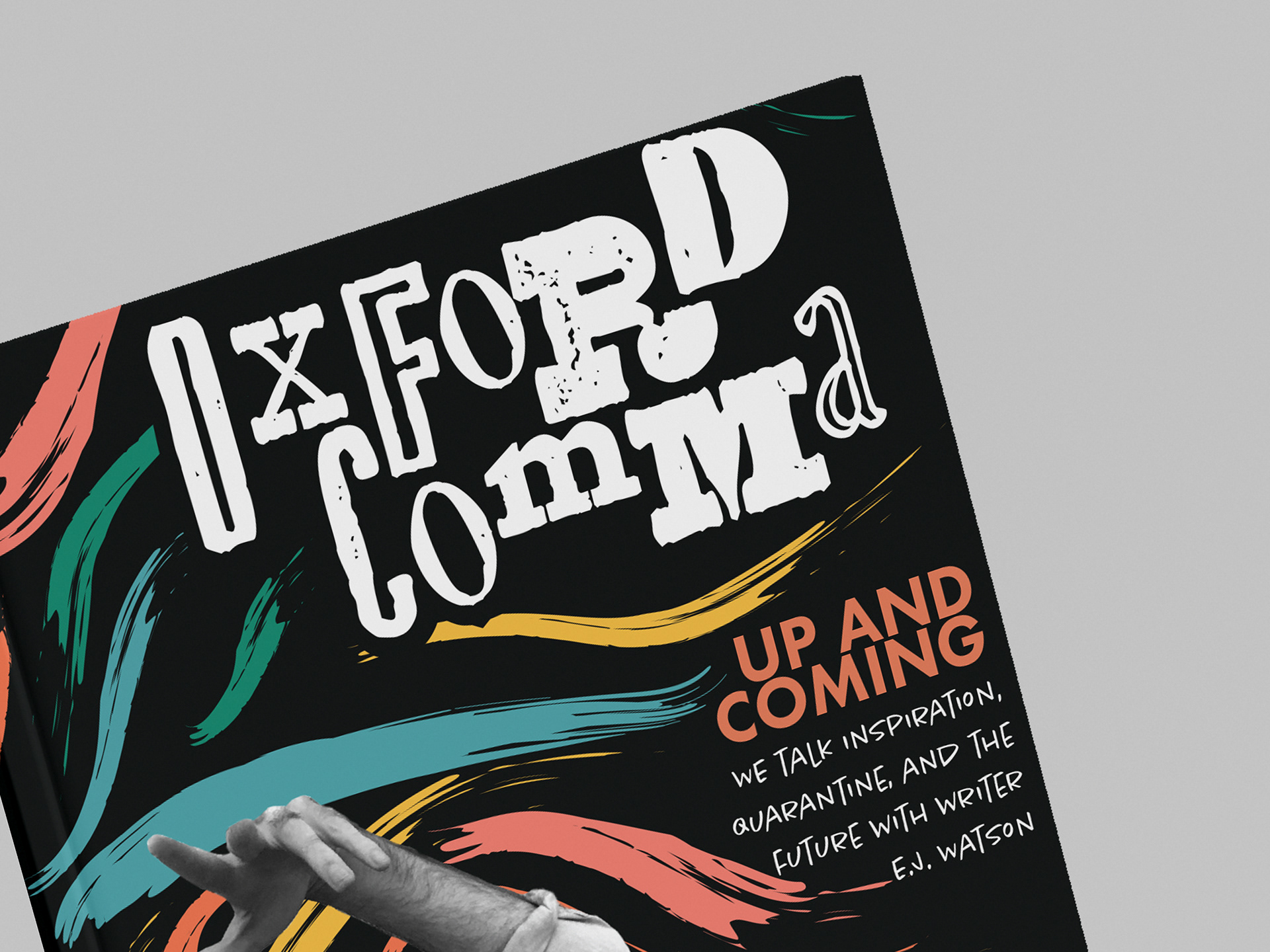
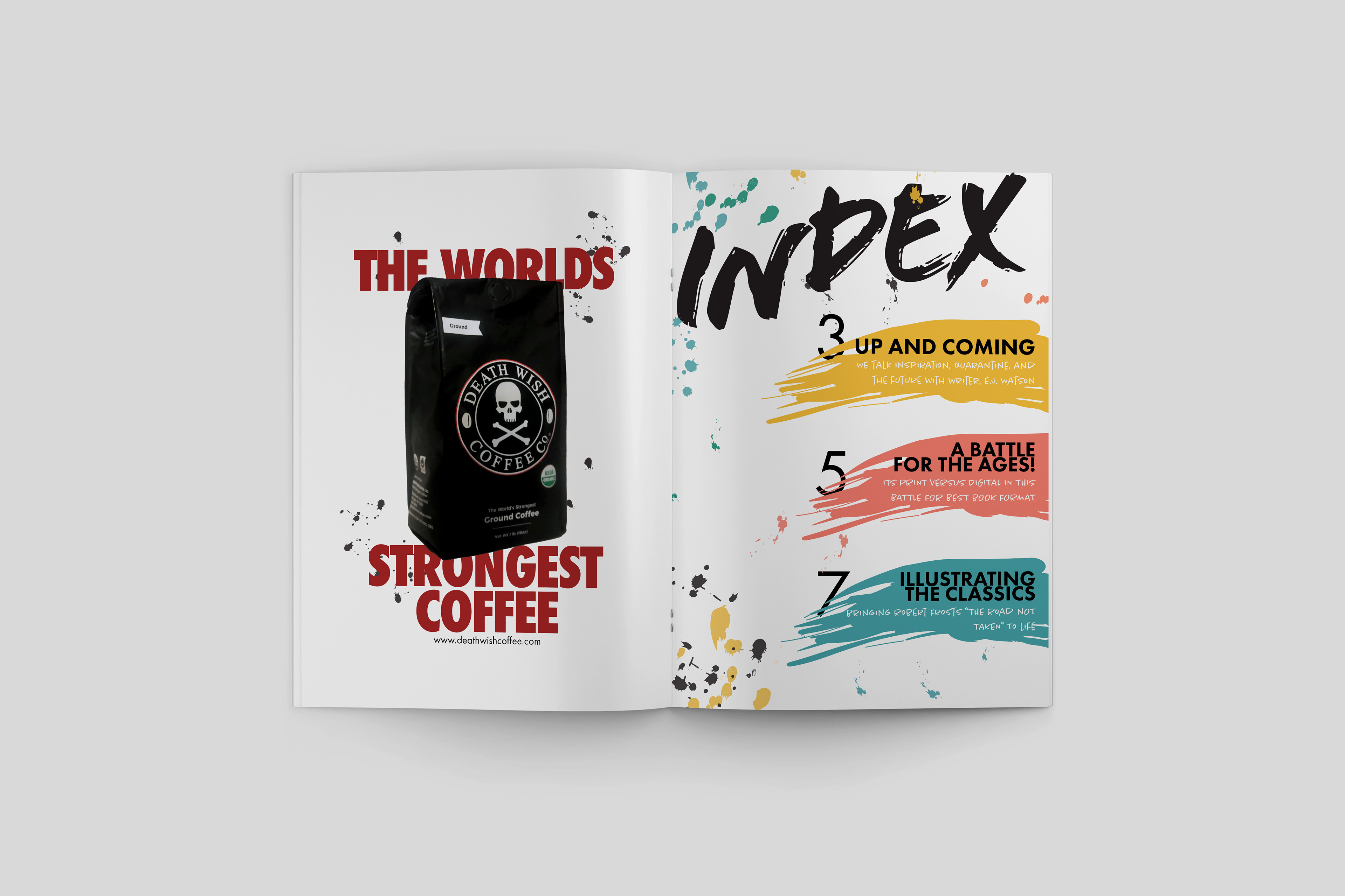
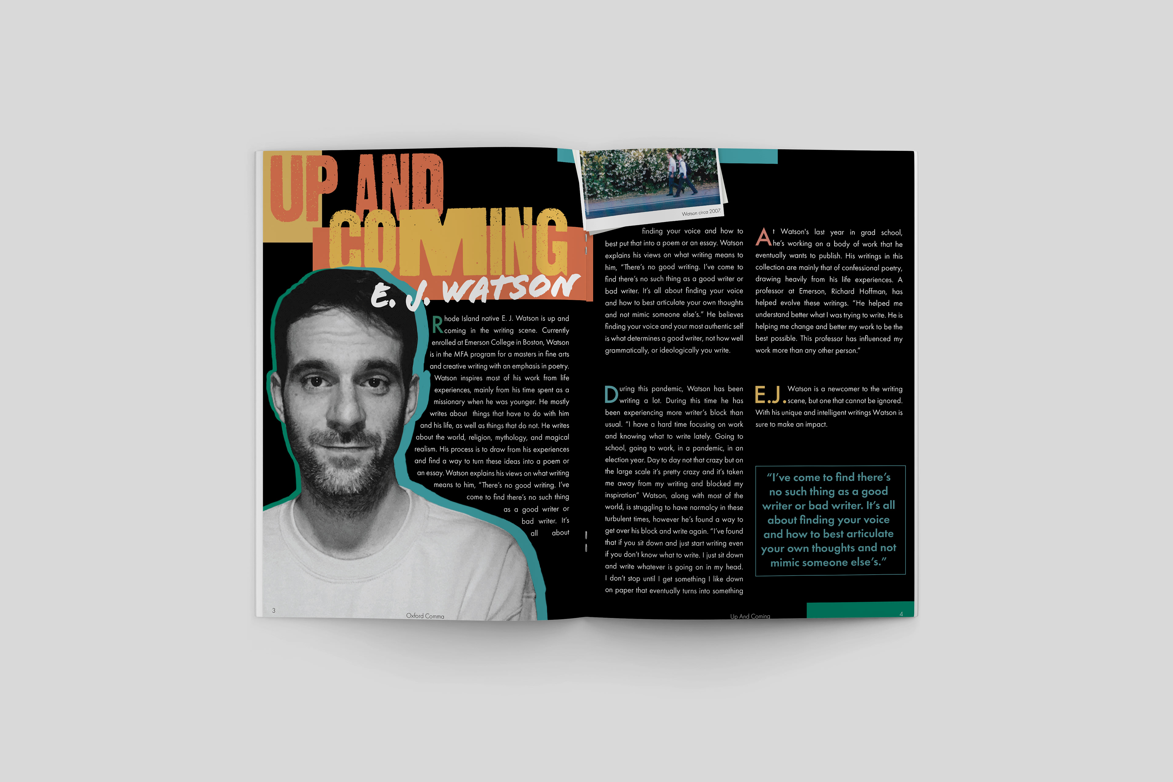
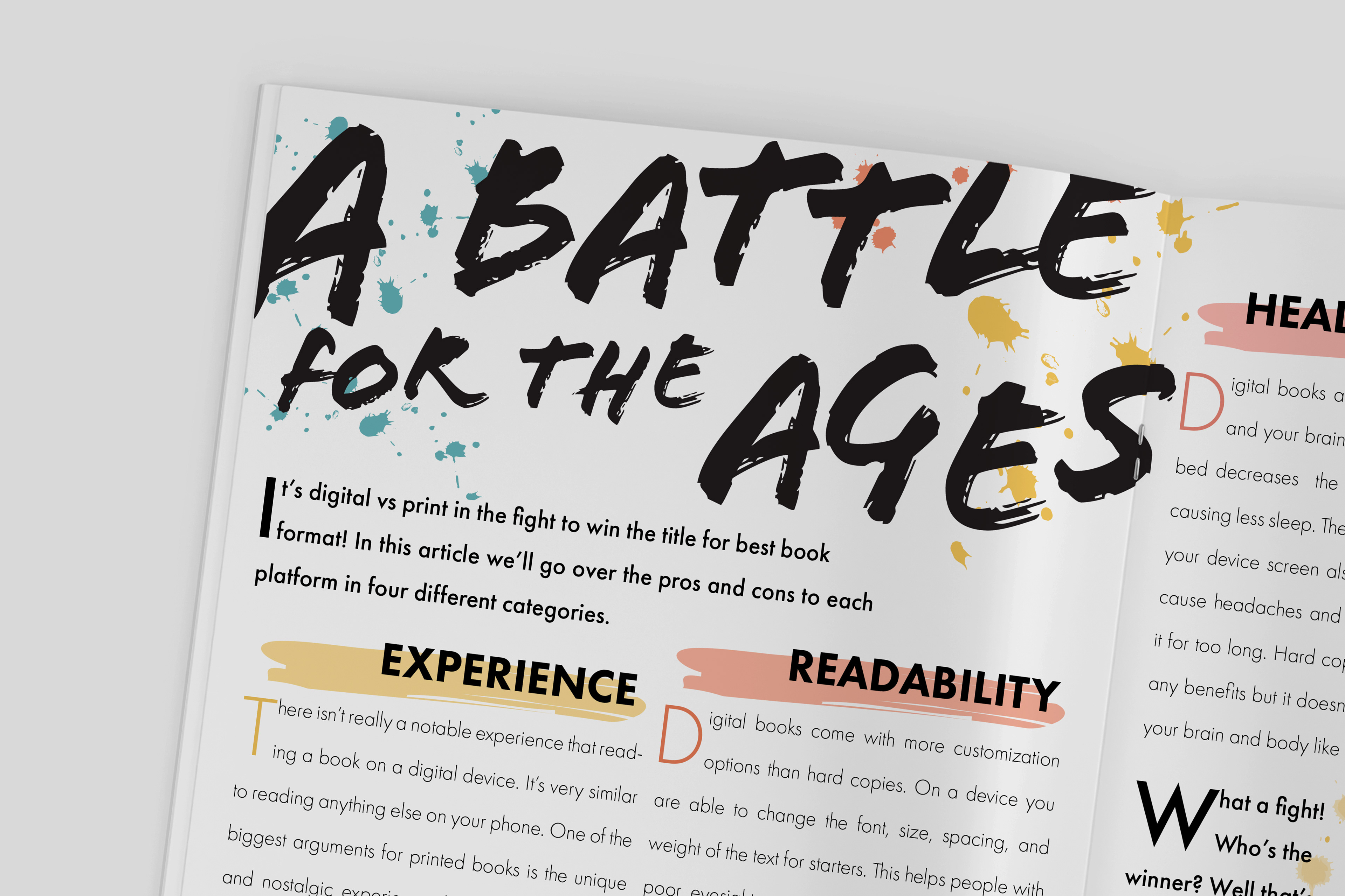
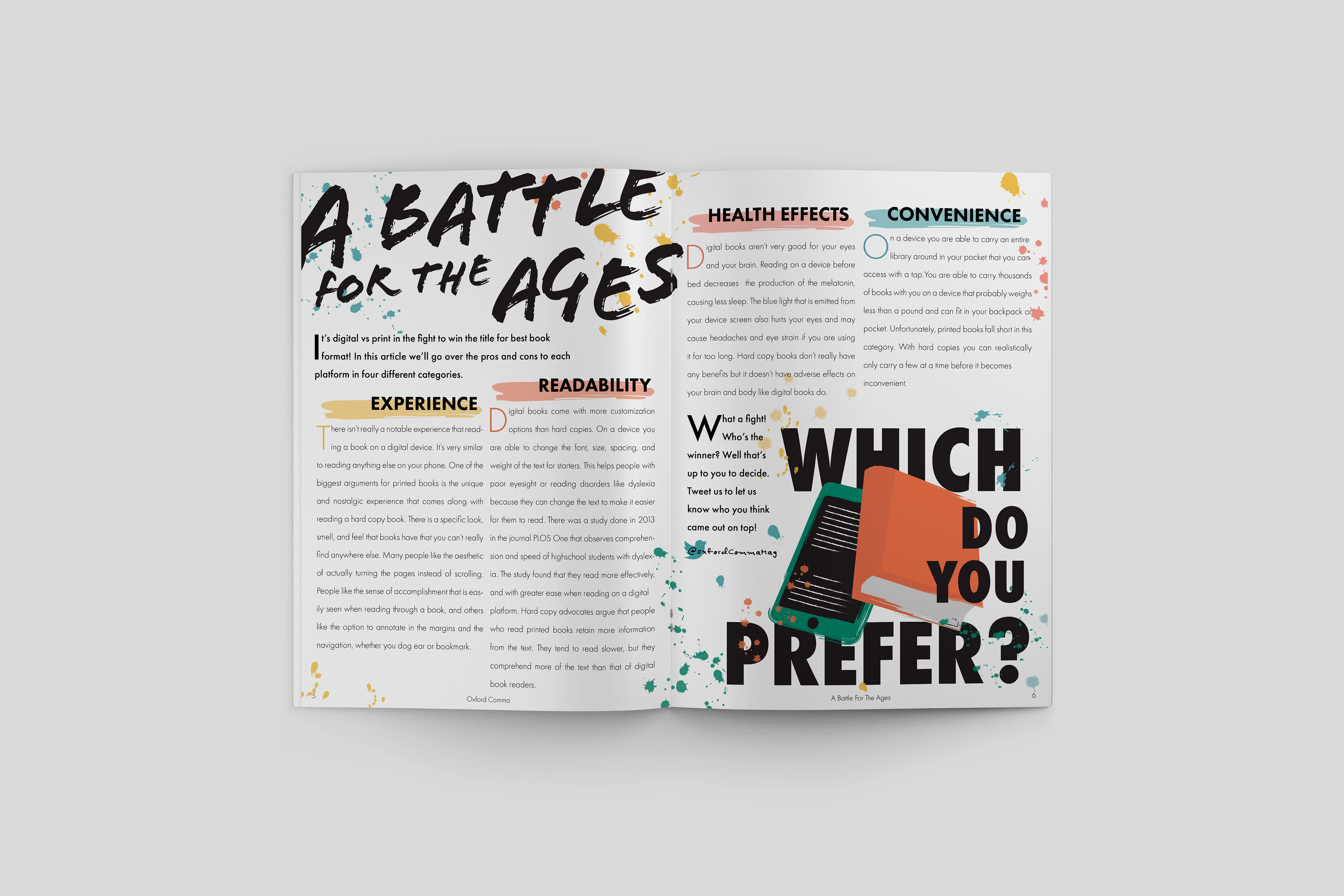
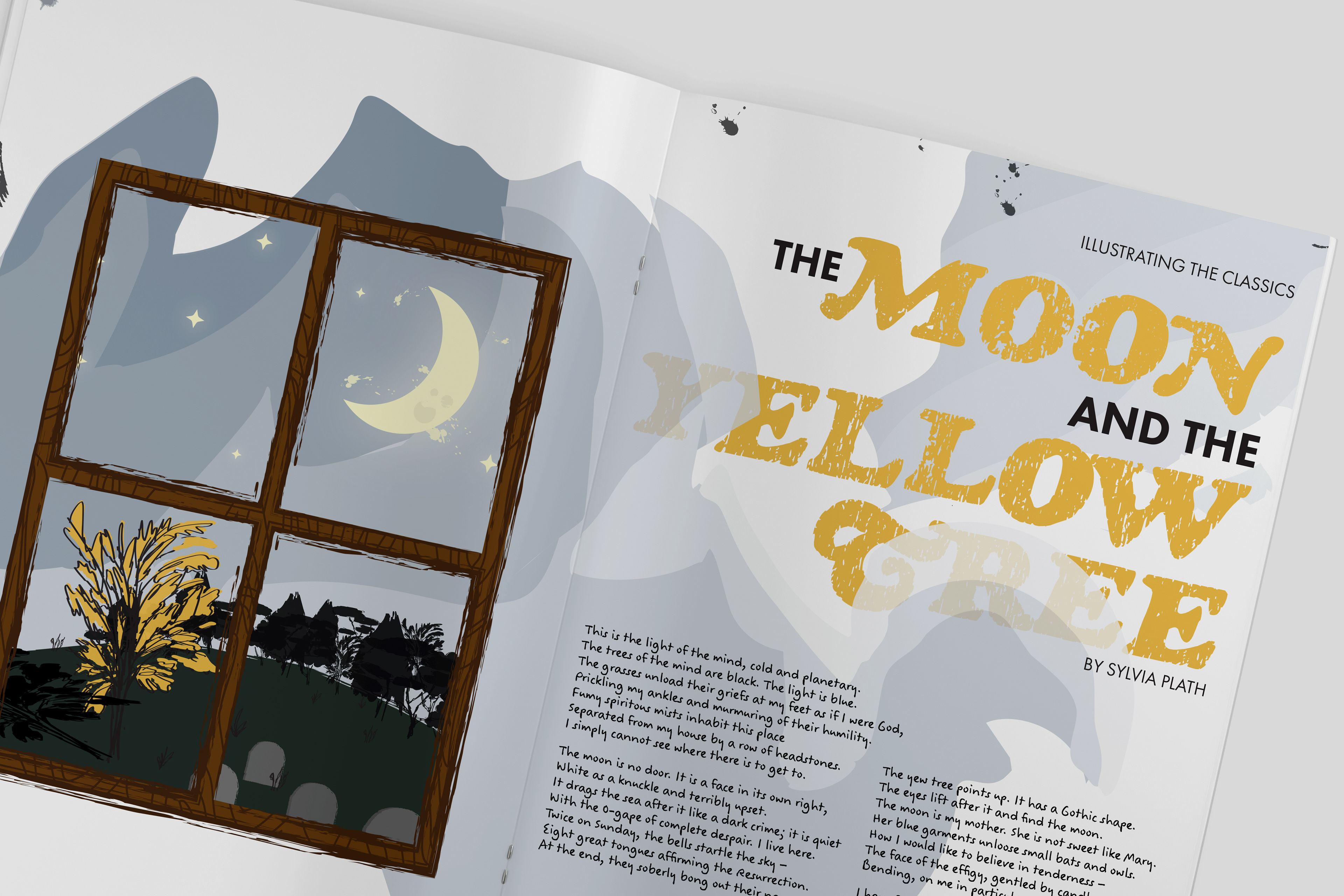
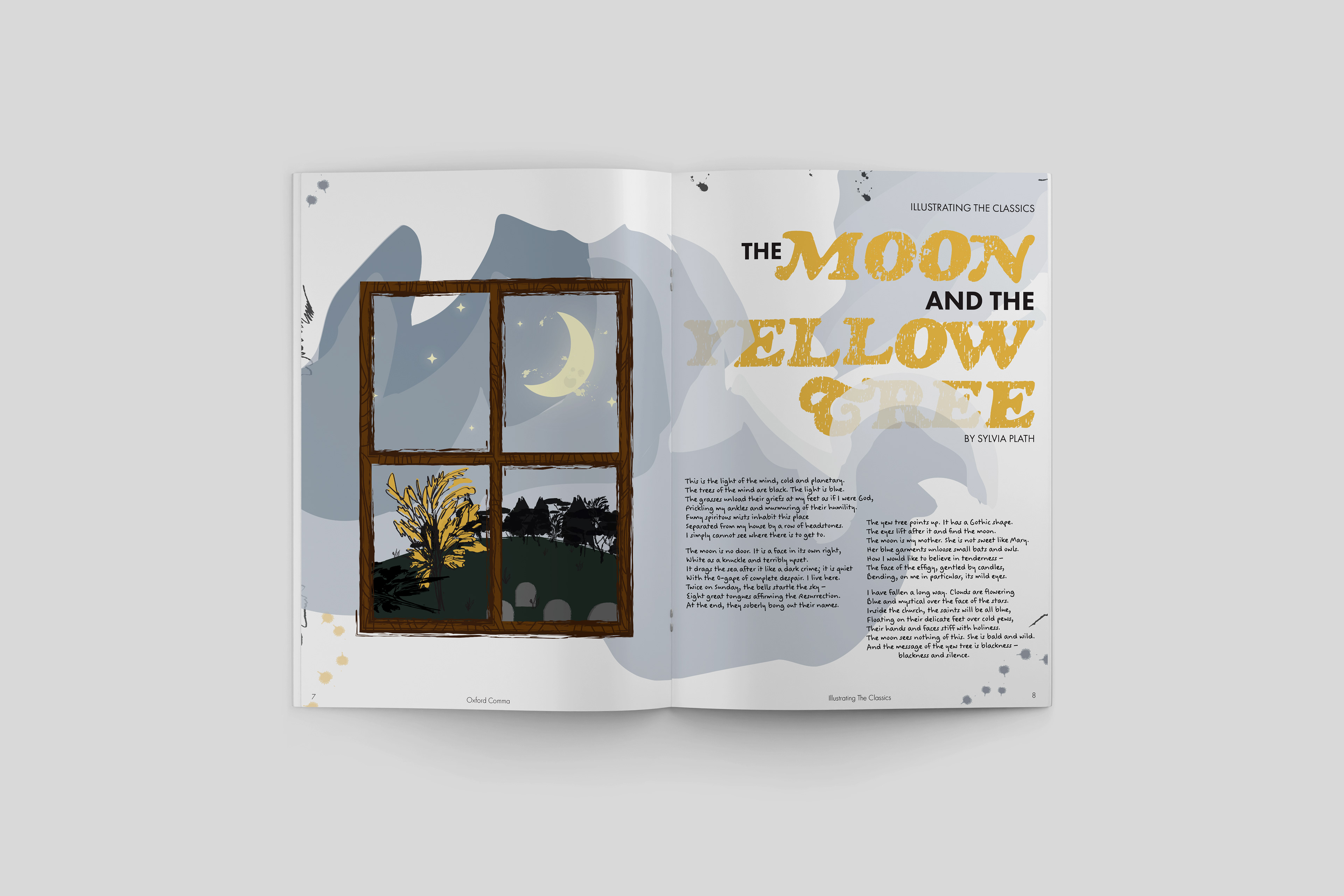
Oxford Comma, titled after the controversial grammatical term and the popular Vampire Weekend song, is a mini-zine, centered around all things reading and writing. The constraints of the project required three spreads; an interview, research, and a creative piece. Additionally included are two ads, and a vibrant eye-catching cover to tie it all together.
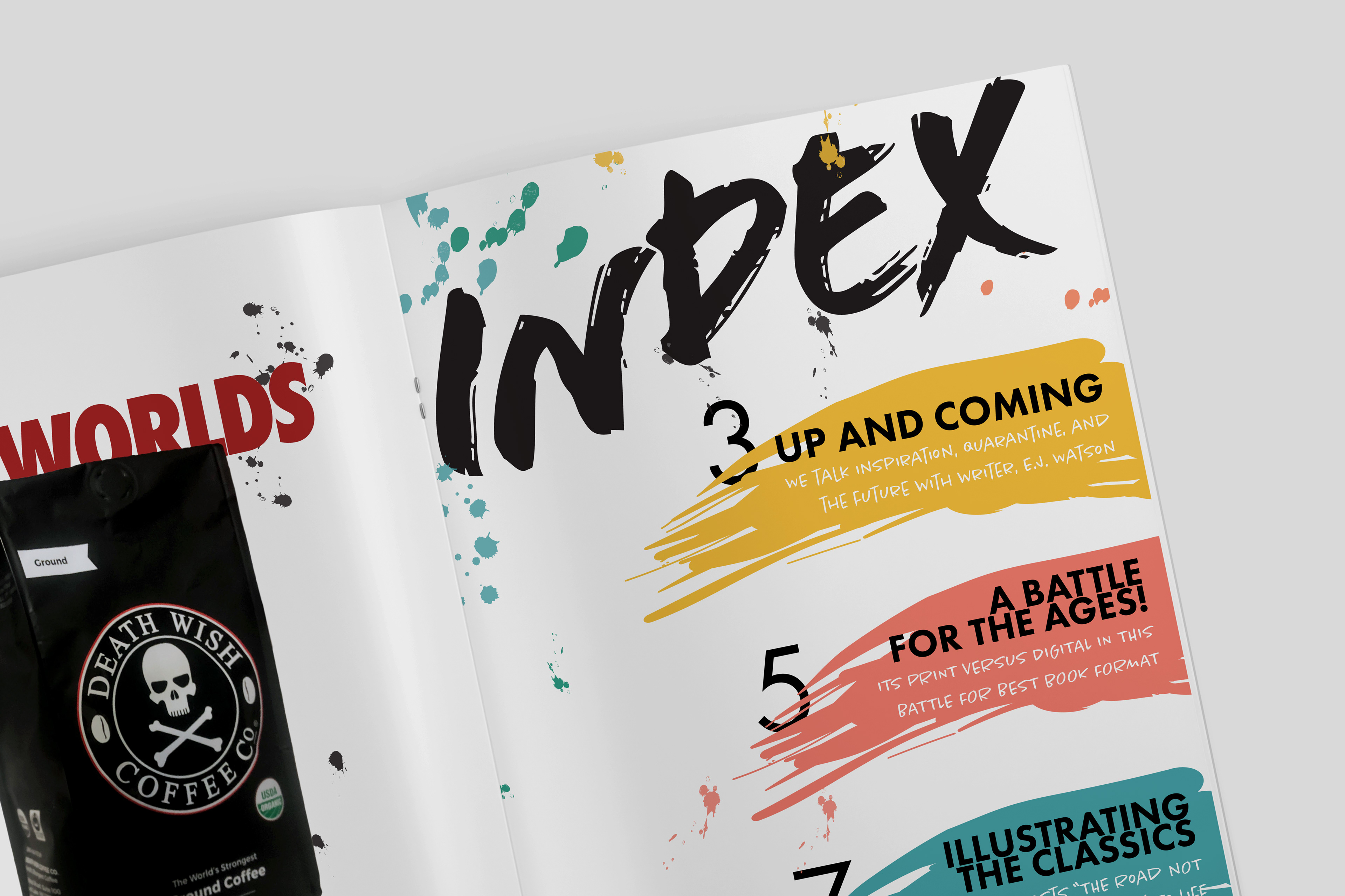
The mini-zine is geared towards writers and avid readers, but sometimes the topic of writing can get pretty dry, I jazzed up the scholarly talk with an ambitious mix of expressive typefaces, a buzzing color palette, entrancing graphics & illustrations. Typography and complimenting font pairings were my primary focus. Each page is its own artistic entity, while still working harmoniously as a whole.
Print • Editorial • Layout • Typography • InDesign • Photoshop • Illustrator
