RHODE ISLAND OUTREACH
A responsive logo design created for a newly-established crisis intervention organization.
Rhode Island Outreach emerges as a newly established crisis intervention organization, poised to serve and uplift the local community during their most challenging moments. Their noble mission revolves around providing crucial assistance to individuals navigating the complexities of mental health crises, offering not only support but also de-escalation skills. In a collaborative effort, students were entrusted with the task of designing a logo, with the understanding that one of the fifteen submissions would eventually be selected. The logo I crafted secured a place among the top three contenders.
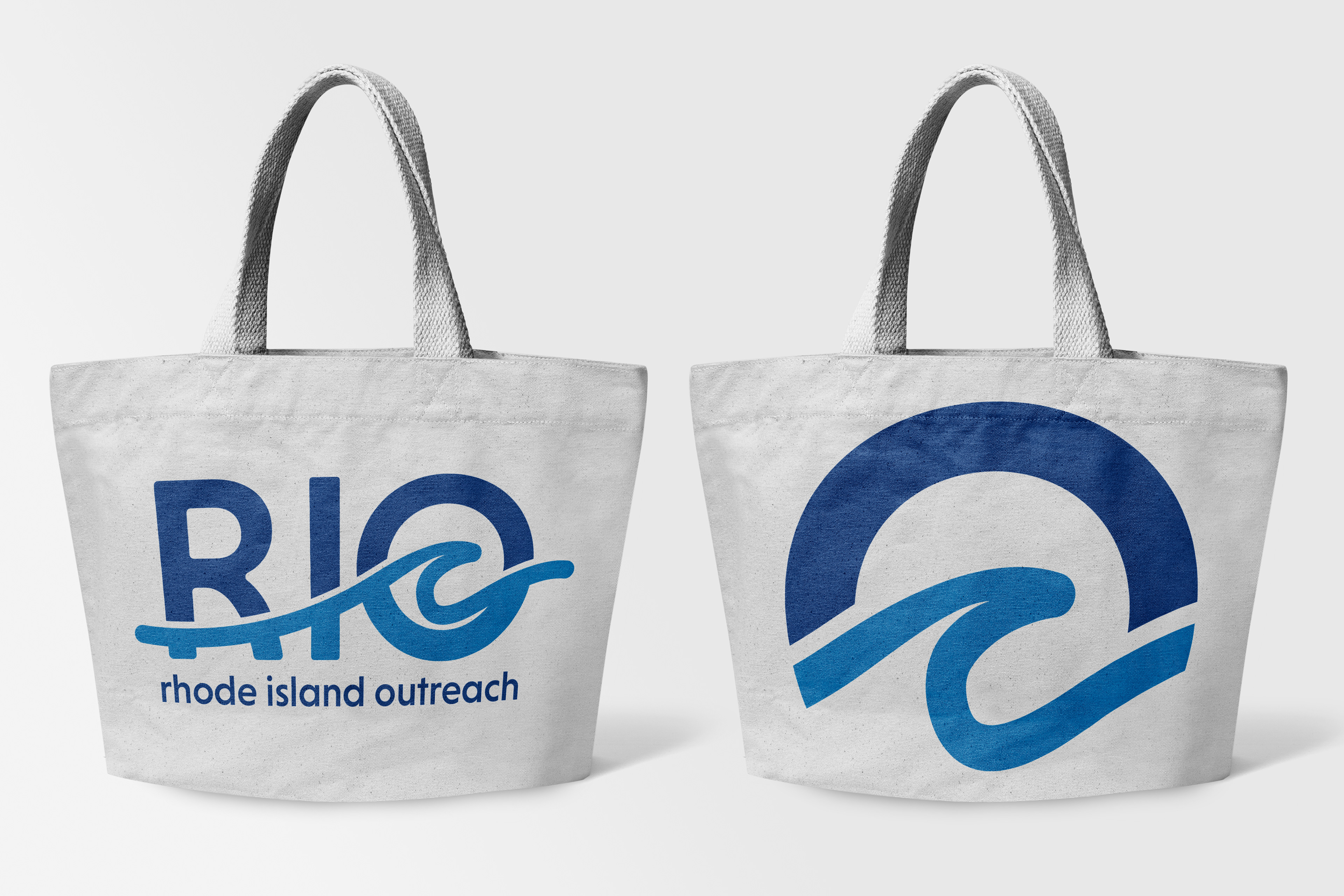
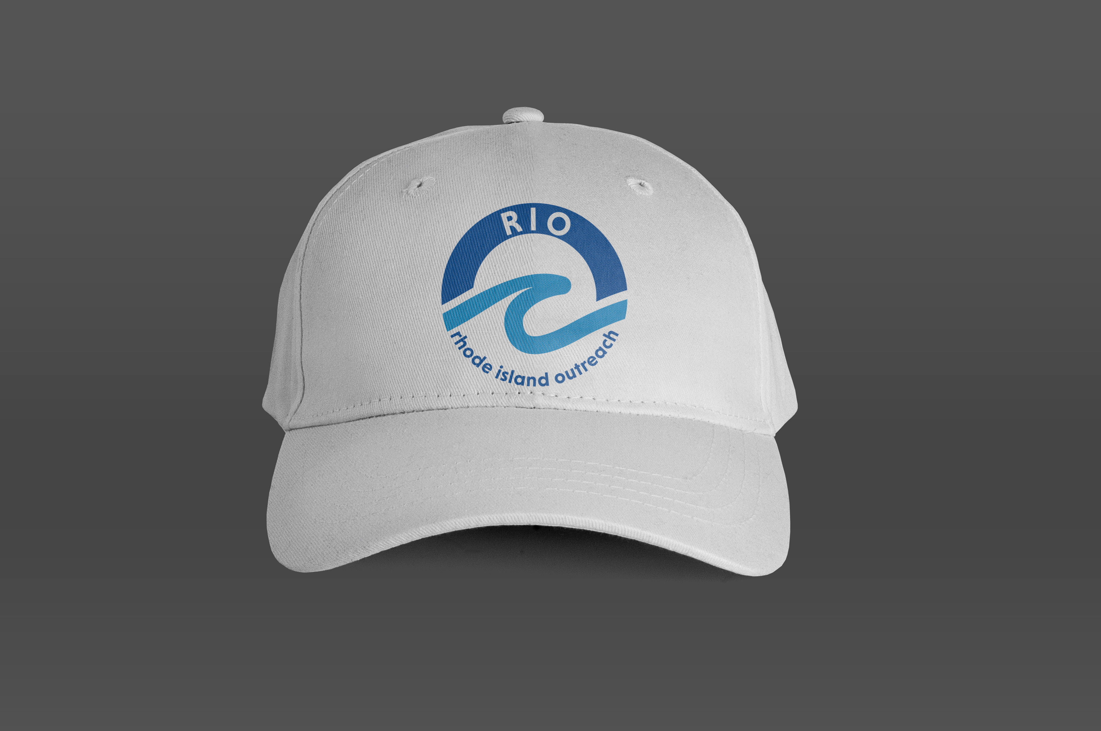
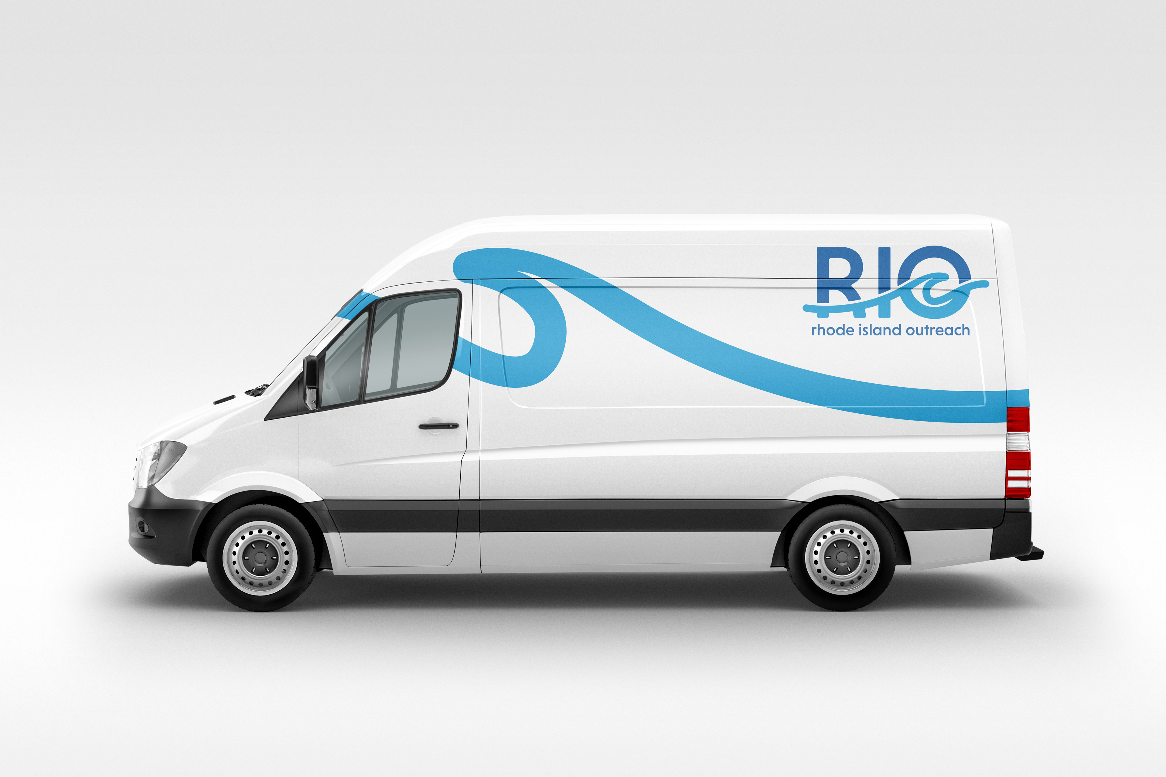
Rhode Island, often referred to as "The Ocean State," boasts a mesmerizing coastline that is deeply ingrained in the identity of its residents. Taking inspiration from this natural wonder, I centered my logo design around the ocean, opting for a minimalist wave. This wave was integrated into the "O" of "RIO," allowing for flexibility in its responsive adaptation. Furthermore, the "O" paired with the wave can also be perceived as the sky or horizon line especially rendered in a darker shade of blue. To ensure pristine single-color printing, I thoughtfully incorporated space between the wave and the upper portion of the letters. The choice of a clean, bold font harmonizes seamlessly with the fluidity of the wave while rounding the corners of the "RIO" mark imparts a welcoming and approachable aesthetic. The color palette I selected, predominantly blue, not only pays homage to the ocean but also invokes a sense of tranquility and trust. In simplifying the logo, I condensed it into a versatile badge design and further to its most simplified form—a stand-alone wave. Through these purposeful design choices, I've crafted an effective logo system that can be employed in a multitude of ways, effectively amplifying the message of this remarkable organization.
Print • Typography • Branding • Illustrator


