THE SHRED COLLECTION
A totally rad subscription box service using Vans® brand guidelines.
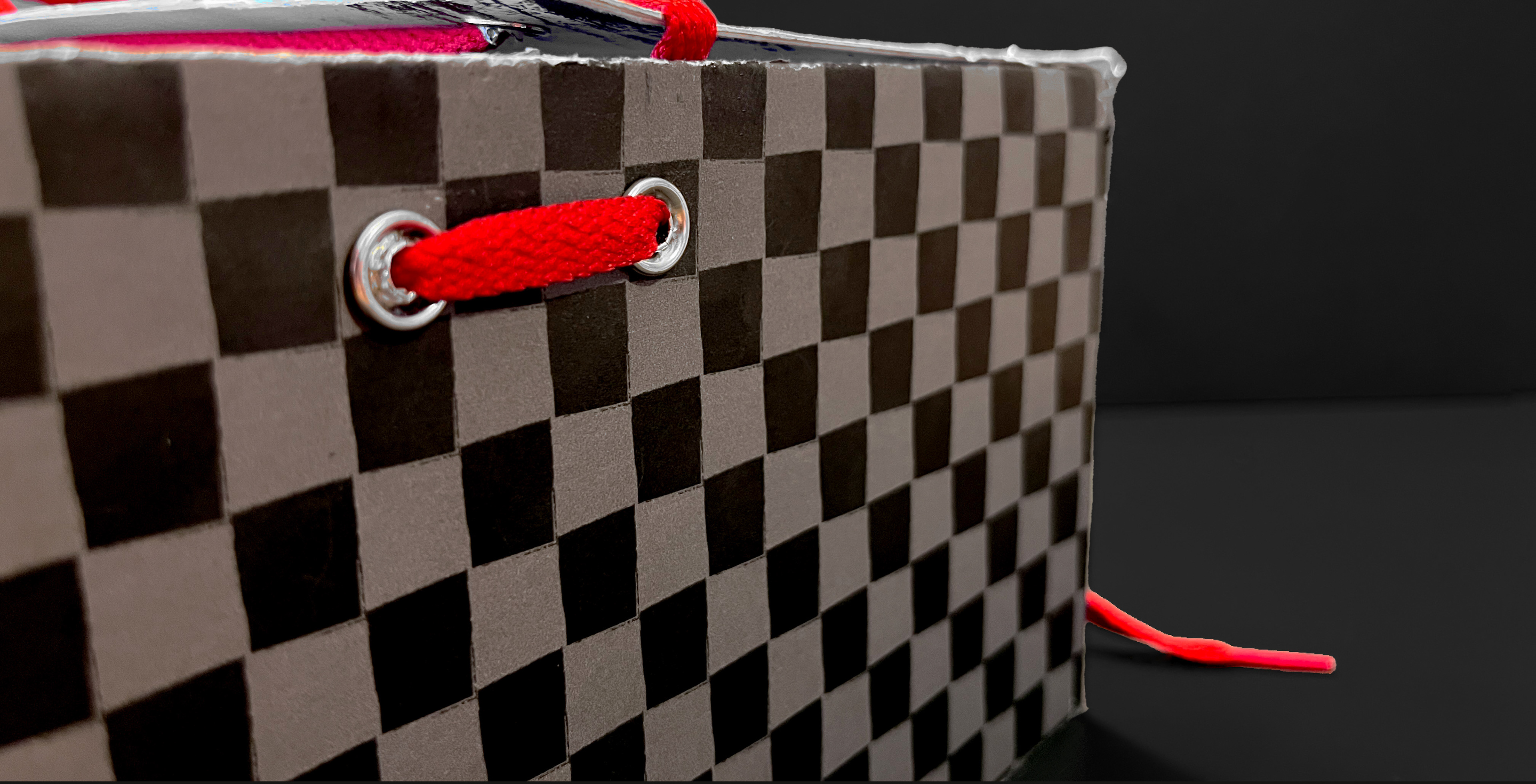
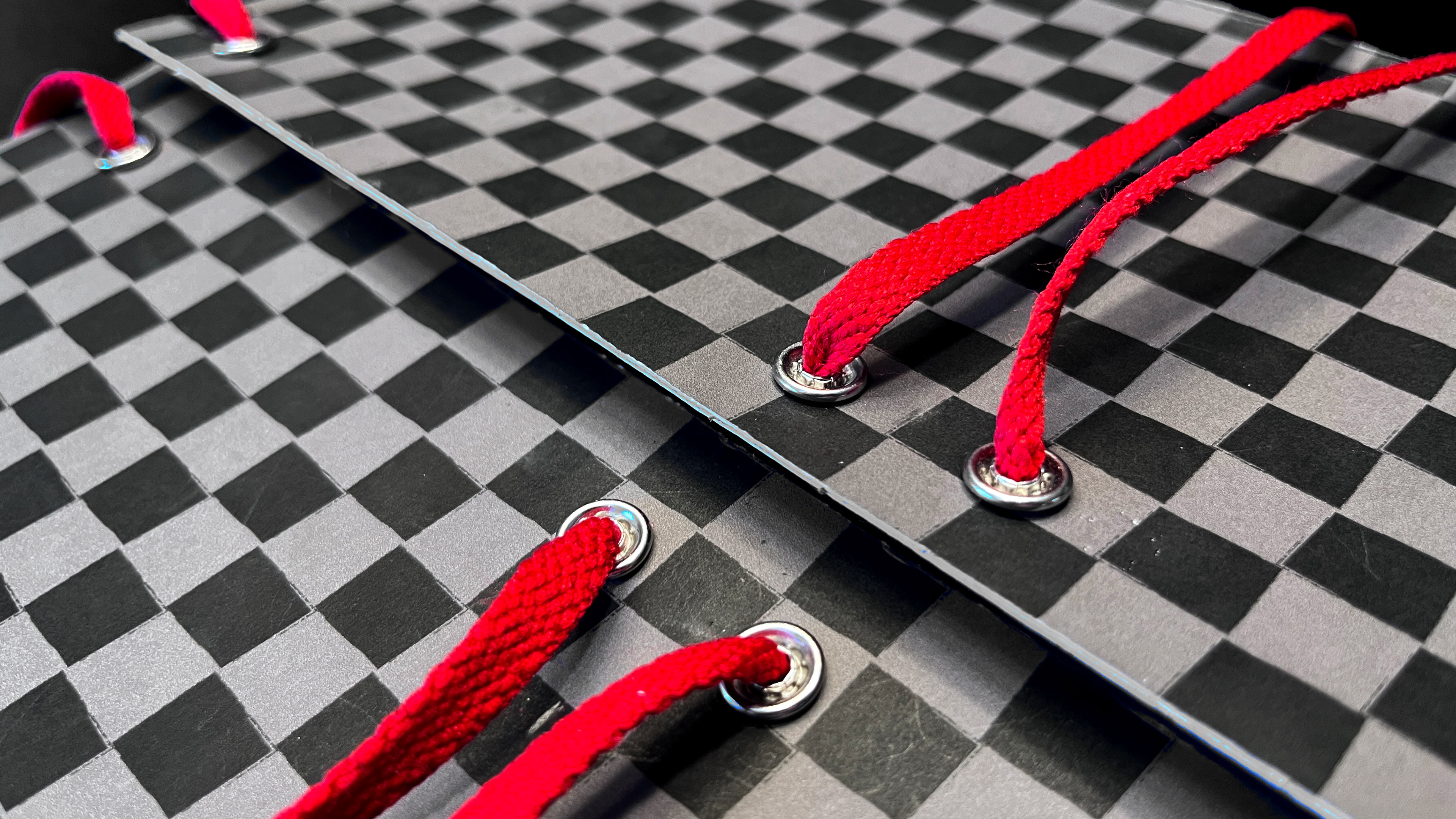
When tasked with designing and hand-constructing a subscription box for a brand of my choosing, I immediately went on the hunt for the coolest brand to exist. We all know Vans®, that classic skate shoe company that’s been dawning the feet of some of the best skaters in the game. In honor of Vans® starting as a skate shoe, I created the first subscription box around the idea of shredding. Whether it’s on the halfpipe, or the soles of your shoes, Vans® are there to shred. After meticulously analyzing the guidelines, I got to work creating & constructing a box. The aesthetic is in the realm of the scribbles and doodles one would find in the margins of a notebook. I utilized various methods to get this desired look, including vectorizing sketches, going crazy in the brush stroke window, and scanning images of my own beaten up sneakers. I also included the iconic Vans® checkerboard pattern, as no Vans product is complete without it! And yes, those sick skate tricks illustrated all over the box, are in fact me… about a second before falling over.
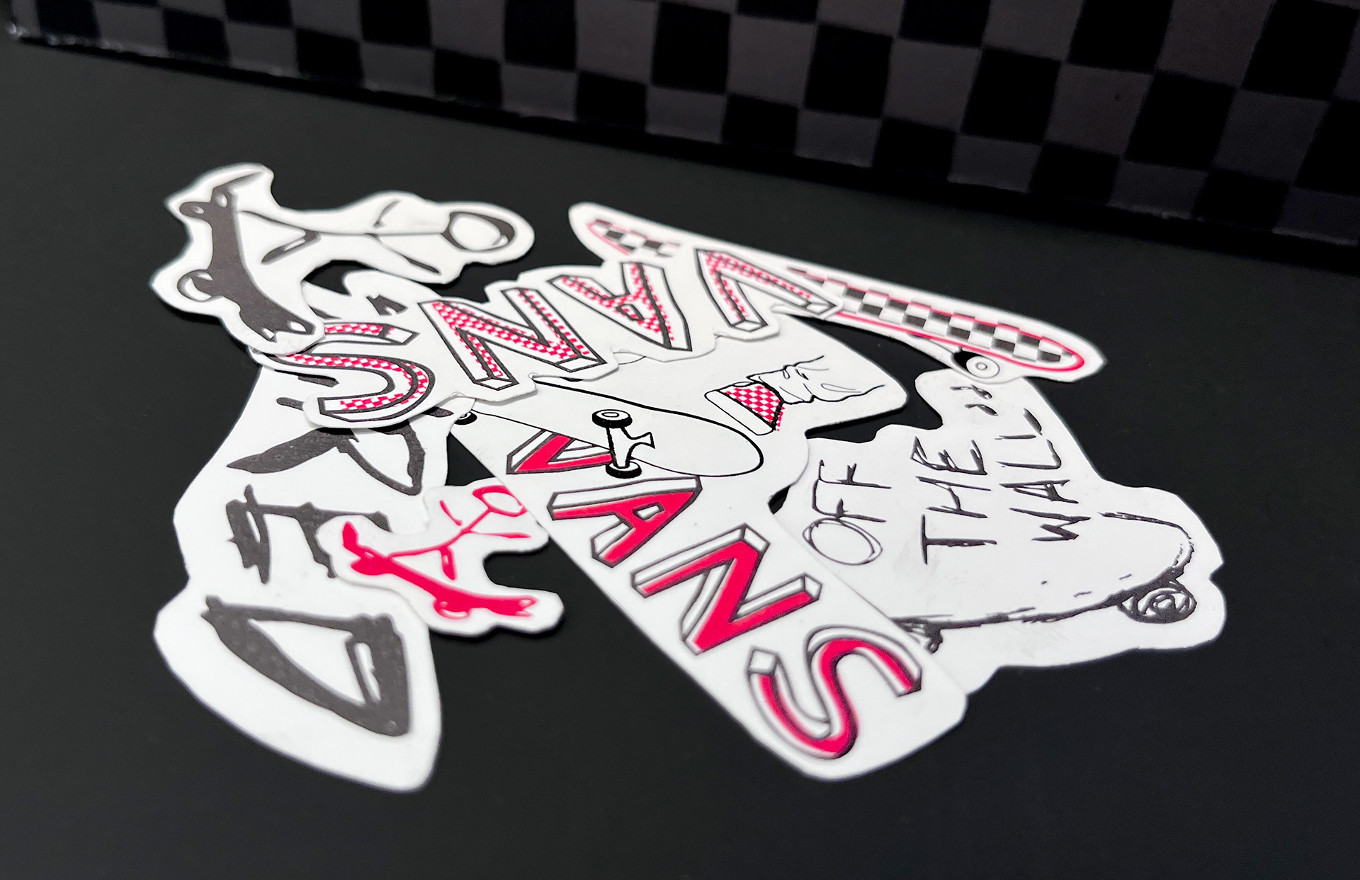
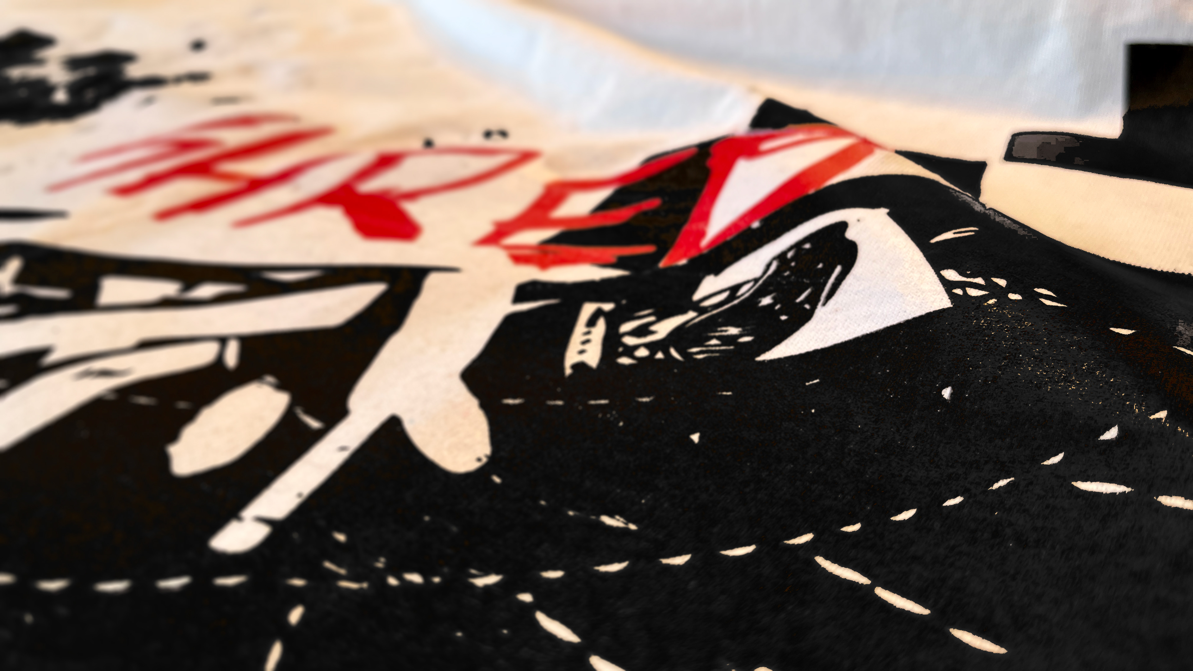
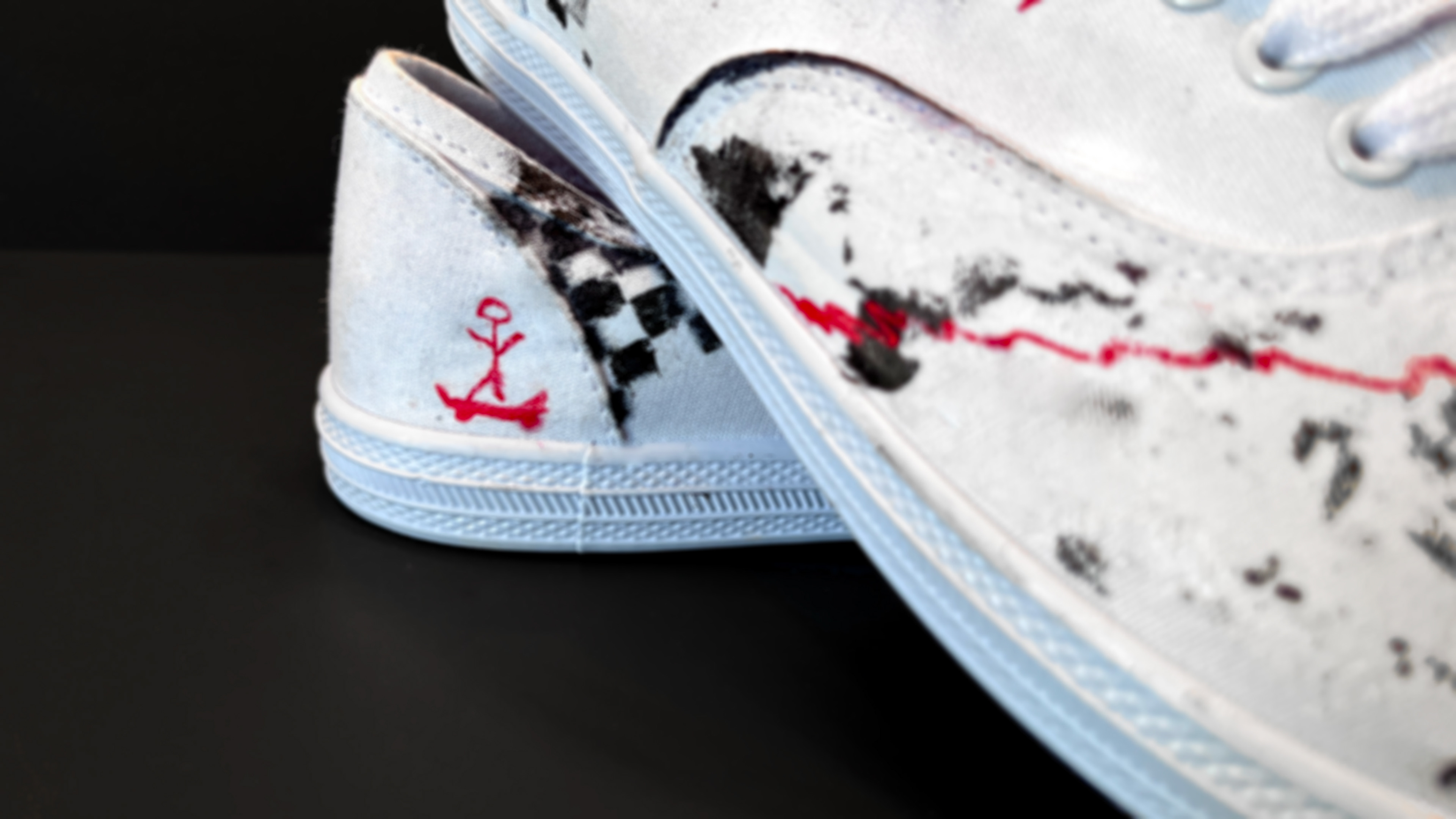
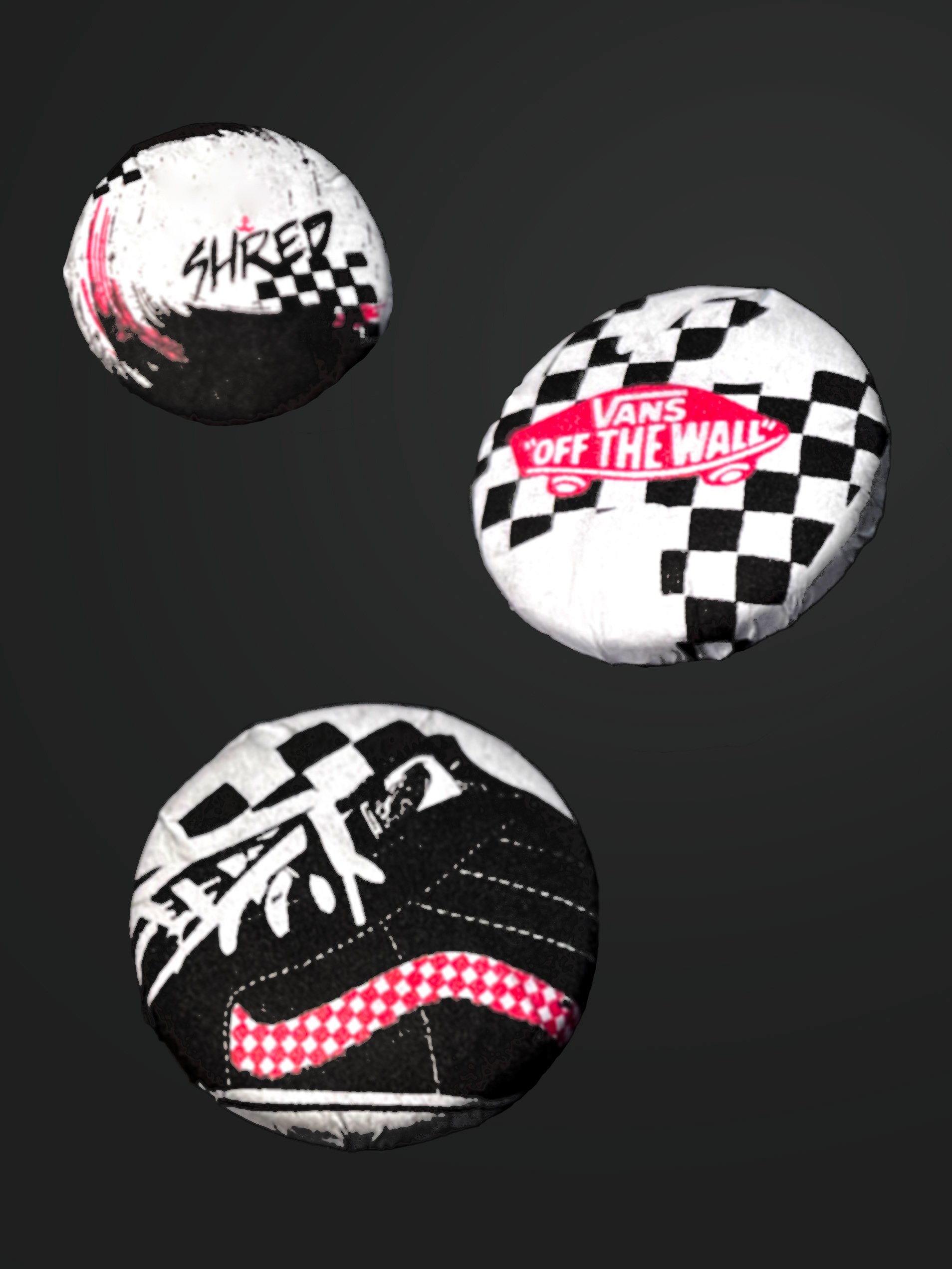
The cool doesn’t stop there, the contents of the box contains some rad swag, including stickers, pins, a t-shirt, and of course a pair of sneakers. All contents were handmade, applying my designs across various mediums. To keep branding consistent, I was sure to incorporate the same color palette, and illustration aesthetic. The final product for The Shred Collection feels chaotic and half-hazard, in the absolute best way possible.
Print ・ Branding ・ Illustrator
