NIGHT OWL
A dark, mystical cold brew that is made for night dwellers.
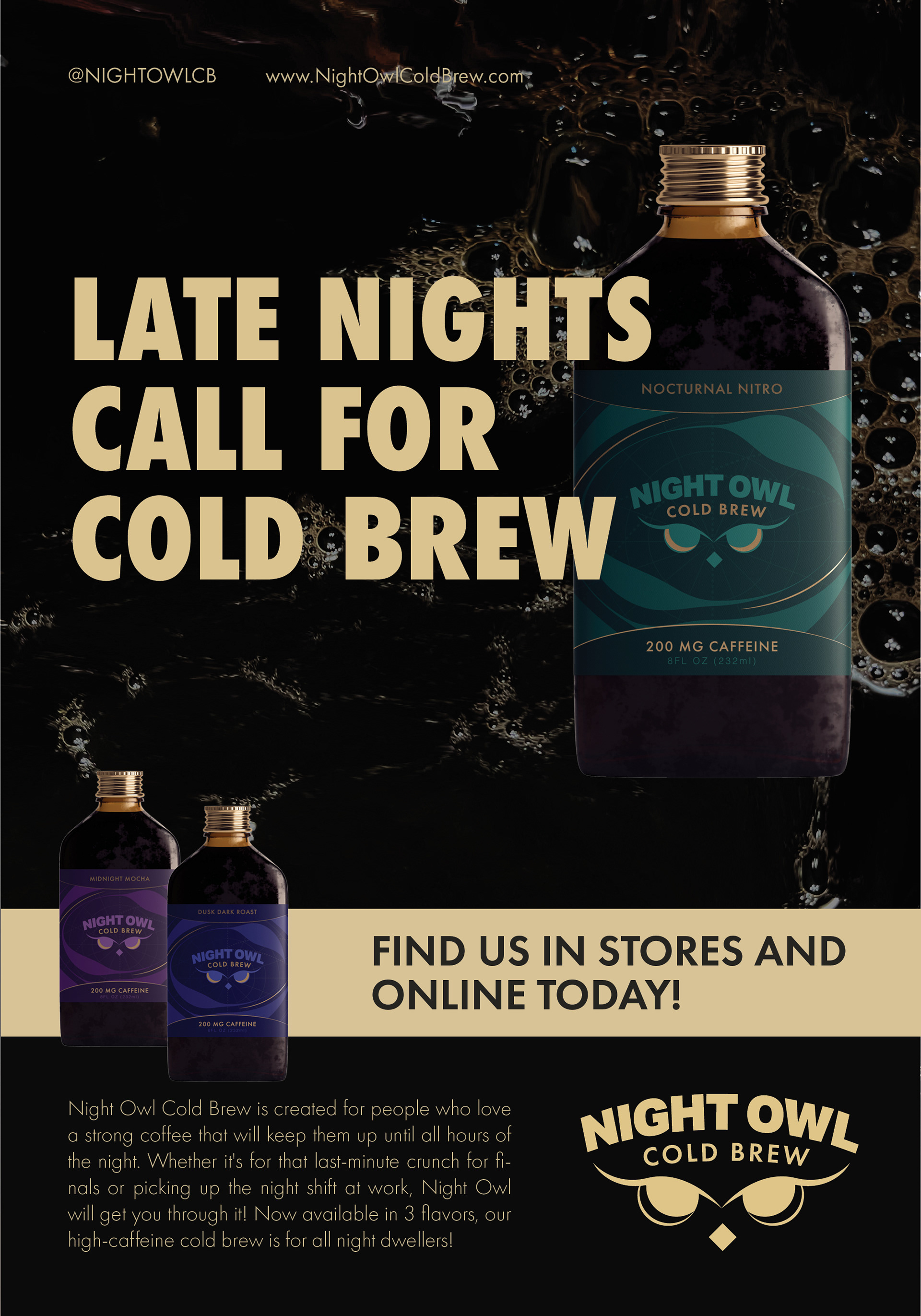
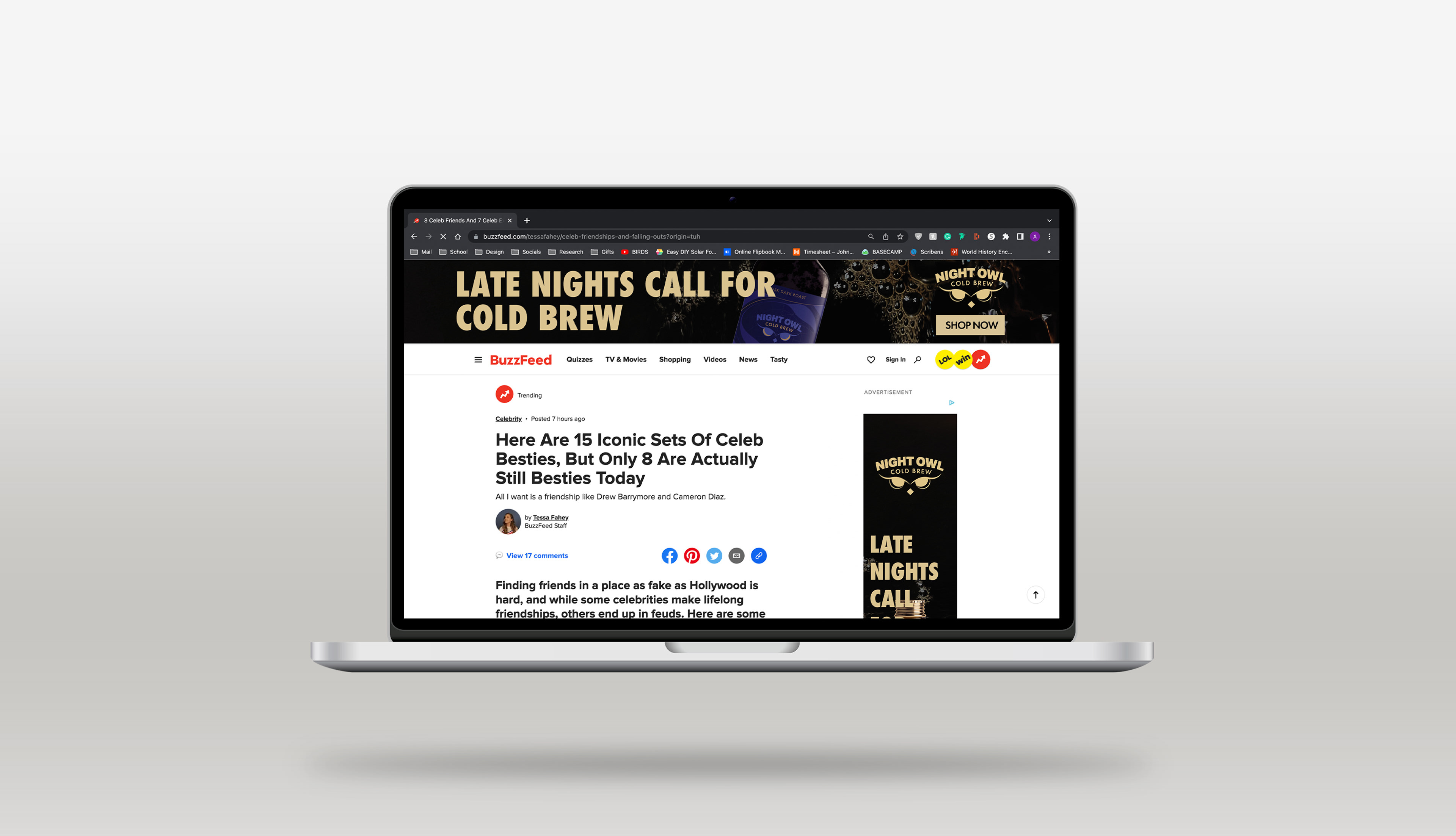
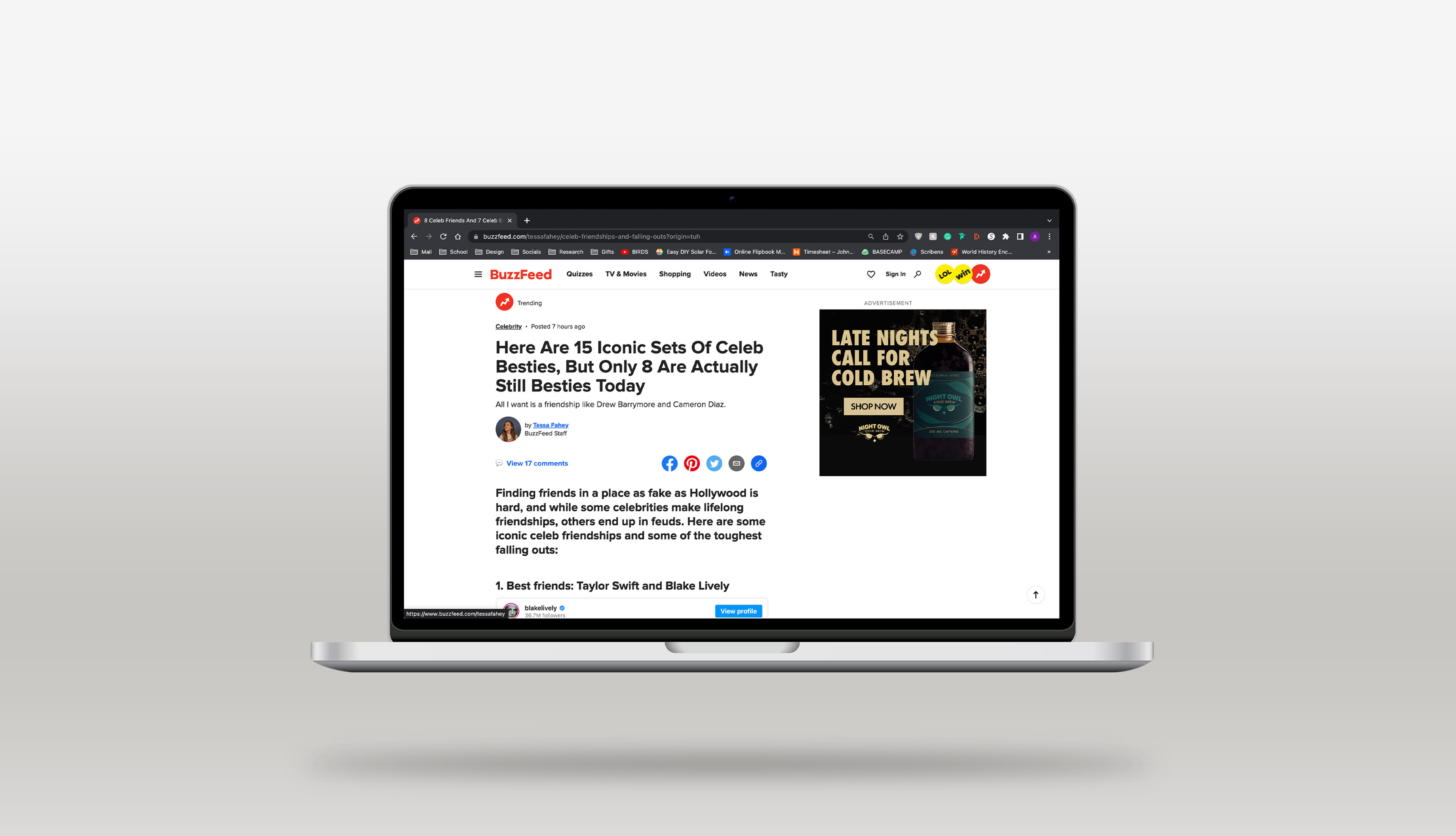
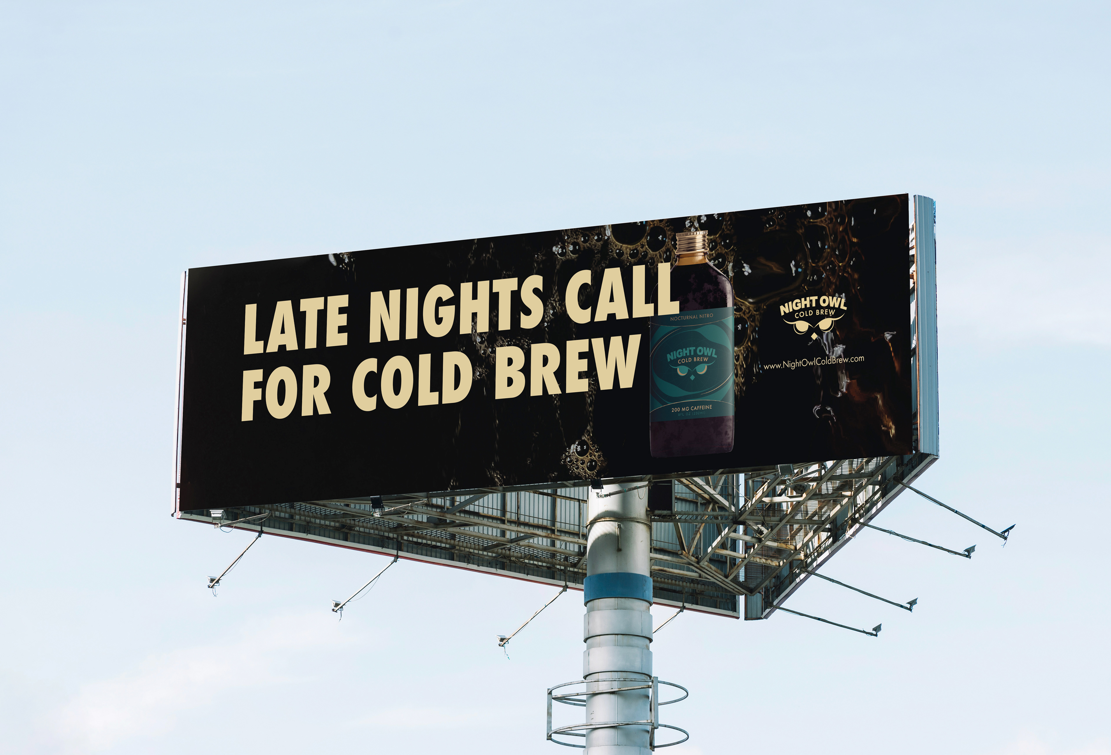
When tasked with creating a beverage brand of my choosing and, subsequent ads, I knew I wanted to design something relating to coffee. The project required 3 printed ads, 3 digital, and a billboard. The print ads consisted of a full page, horizontal half page, and a vertical 1/3rd page ad. The digital ads consisted of one vertical, one horizontal, and one square banner. Night Owl came out of a previous logo project in which I built the branding around. The owl eyes refer to the brand name, as the coffee brand is geared towards individuals who stay up late into the night. To evoke a high-end feel, I included elements of gold metallic in the label and bottle. I Incorporated it in the owl eyes to symbolize the glow in the dark, and a few hints on the rest of the bottle to tie it all together. Being the illustration and pattern was at the forefront, I kept the typography simple. The visual coding used for the line uses different colors to symbolize the different flavors. All colors stay within the same shade, keeping everything dark to further emphasize the nighttime feel.
What’s a brand without advertising? I wanted to keep the advertising all relatively the same, only changing or simplifying the layout according to the size and orientation of the ad. All ads feature a pool of coffee in the background, with the bottle emerging through. The text is all in a gold color to match the gold on the bottle. Keeping it simple, the tagline is in a large bold font to grab the viewers attention. Through my use of color, typography, and photography, the brand and advertising fully embodies the dark nighttime feel that all night owls thrive in.
Print • Marketing • Packaging • Branding • Illustrator • InDesign


