TYPOGRAPHY POSTERS
Two of the most popular typefaces, that couldn’t be more different.
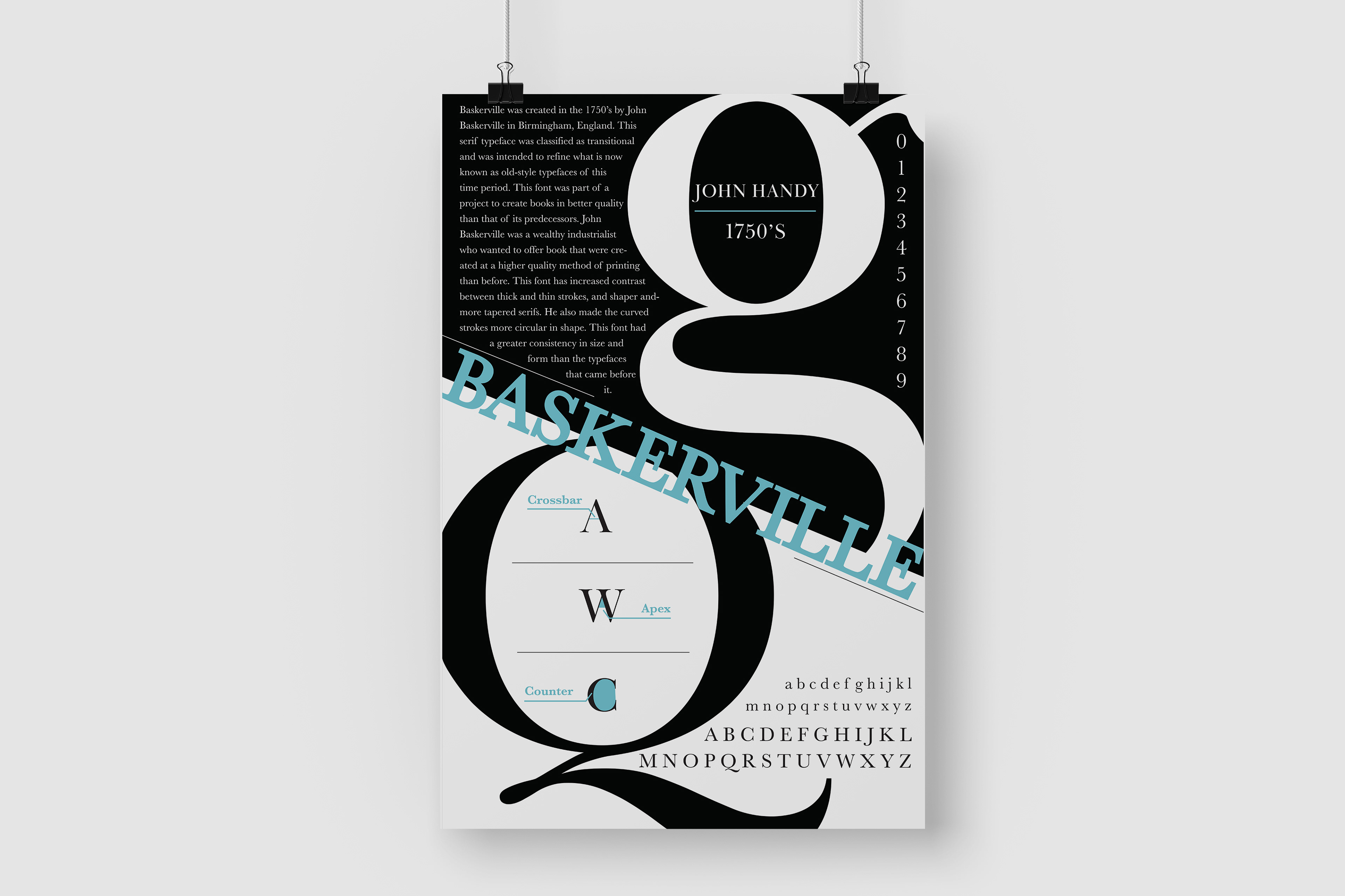
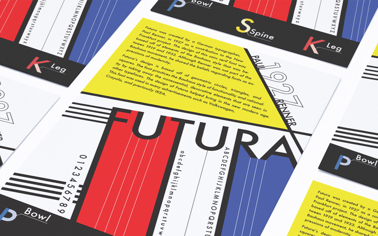
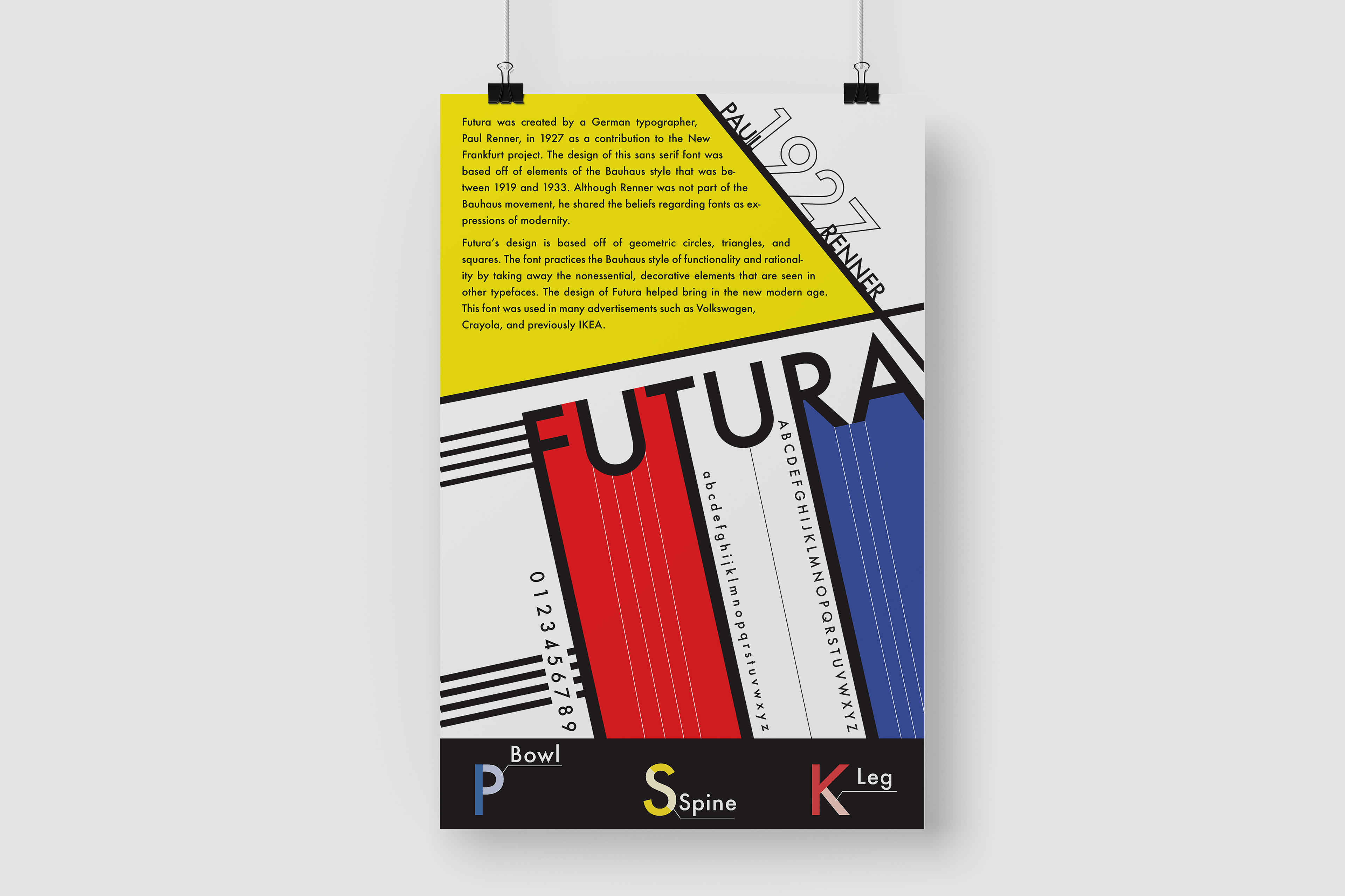
Futura and Baskerville are two classic, contrasting typefaces that were begging to be displayed in poster form. The parameters for this project required me to include the font’s name, history, typographer, date, alphabetical and numerical examples, and type anatomy for each respective poster. For both designs, I focused heavily on my typographic treatment, using various weights, sizes, colors, and cases to construct a hierarchy of information on each poster.
Futura’s poster really needed to encapsulate the Bauhaus era in which the font was created. I incorporated recognizable geometric shapes and lines, paired with a simple color scheme, frequently seen in Bauhaus-style. For the Baskerville poster, it was necessary to showcase the classic feel that the font exudes. Featuring some of Baskerville’s most unique letterforms as graphic elements, I used the negative counter space of the letterforms to contain vital information. Through the use of shape, color, and of course typography, the unique aesthetic and vibe of each typeface was effectively explored to represent each font.
Print • Poster • Layout • Typography • Illustrator


